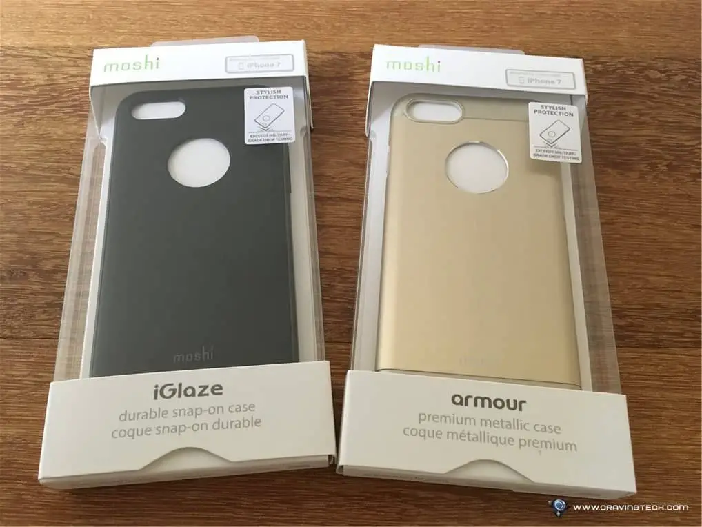
Moshi Armour and Moshi iGlaze Review – With every new iPhone release, I am always looking for that ‘best’ phone case. I use my phone a lot during the day, especially during commute, so I need to make sure that the case that I use ticks all the boxes.
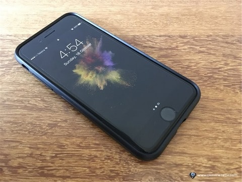
I was given a chance to try out two of Moshi’s new iPhone 7 cases: Moshi Armour and Moshi iGlaze, and I was instantly drawn to their simple yet stylish designs. This is very important for me as I want a case that looks professional in a boardroom but also very sleek looking for when I socialise with my friends over the weekend.
The cases are also known to exceed military-grade drop testings (MIL-STD-810G and SGS-certified), which makes these cases even more attractive, so I decided to take two of them out for a spin in the real world.
Style
The only thing that separates between Moshi Armour and Moshi iGlaze is pretty much the look and feel.
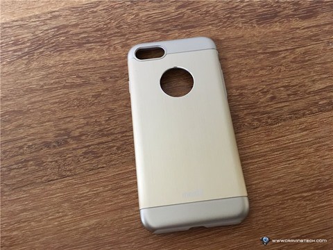
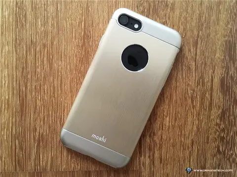
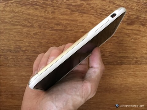
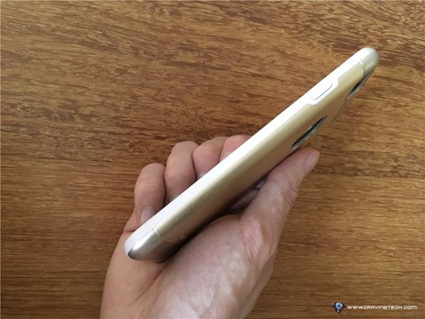
As the name suggests, Moshi Armour has an aluminium ‘armour’ backplate with a metallic finish. I selected the Gold colour (out of possible four which also includes Rose, Grey, and Black) to accentuate my black iPhone 7. The aluminium backplate really brings the high-end, luxurious feel to the case, with a silver reflection around the rounded cut in the centre to give the Apple logo a chance to shine, literally.
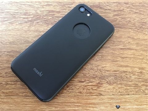
Moshi iGlaze is pretty much similar but has a lot calmer look. It has a matte finish on the back and a slight highlight on the sides to give the case an accent.
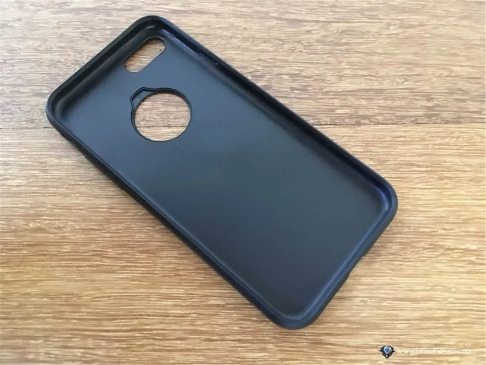
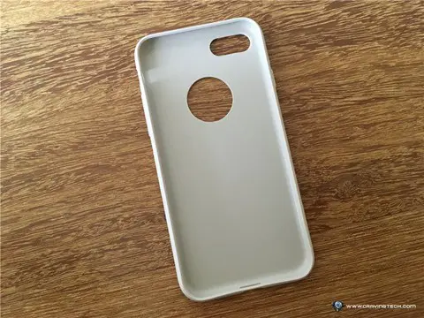
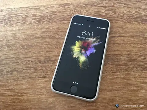
Both of the cases are very slim, despite having added some depths as a protection when the phone is placed on a table, either display-side down or camera-side down. They feature a thick and sturdy but soft, rubber-like fronts and linings which, I am sure, serve as shock absorbent.
Putting it on and off
One of the things that makes me nervous when using a case on my phone is when I have to put it on and/or off. Some cases might look really good but is really hard to put on and makes you feel like you need to bend and scratch your phone to fit them on. And even after you’ve succeeded, you are dealt with another task of taking it off.
Both of these Moshi’s cases are anything but. With rubber-like front and internal lining, putting the case on is as simply as pushing your phone in — all without the worry of leaving scratches on your phone. Taking it off is also a breeze, just by slightly bending the case and pushing the phone out from the ‘Apple logo hole’ at the back of the case.
Usage
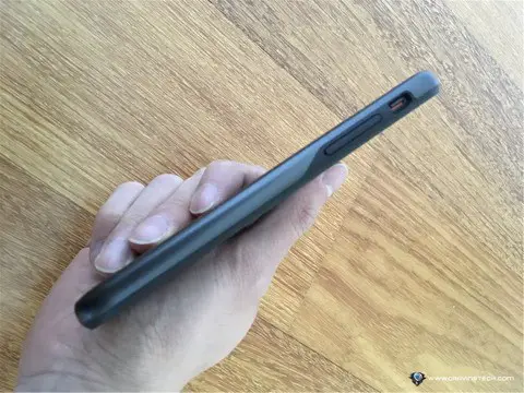
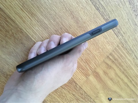
Both cases were very gentle on the hands, including the aluminium backplate on Moshi Armour which does not distract your senses whatsoever. The rubber-like lining which covers the volume and power buttons are so soft you do not need any additional force to get through those buttons. The clicks are still very responsive. It feels very smooth and distinct when you click those buttons through them. There is one continuous button which covers the volume-up and volume-down buttons, and that introduces an entirely new tactile experience I have never previously encountered from other cases. Actually, it feels a lot smoother than clicking the buttons directly on the phone!
Charging the phone is also a non-issue and the bottom speaker is still readily accessible. The only slight inconvenience (and I am nitpicking here) is when accessing the mute switch on the side as it is a bit deep inside the case and might require the use of your little finger to access the button (especially if you don’t grow long enough nails).
Continuous Use
After a few days of continuous use in a normal office-and-commute environment, Moshi Armour still looks very new and all the elements still feel very sturdy. It copped some minor marks on the backplate (which is what a case is made for) and there is an blue ink mark on the rubber (which it might have gotten from a pen) that doesn’t seem to want to come off. The latter is obviously only applicable to light-coloured cases.
The back hole is slightly nice for a change in texture and to showcase the Apple logo as well as the original colour of your phone, but moreover, it serves as a functional reason to easily take the case off the phone by pressing the phone out through it.
As for Armour iGlaze, the matte finish proves to take a lot more fingerprints and oil, so a more regular wash and clean is needed. Some of the side gaps between the two different materials seem to be accumulating some dirt as well, and my attempt to clean it only made the dirt went deeper into the case. But this is just a very minor issue.
Verdict
Overall, Moshi has done a really good job in creating a great case that ticks all the boxes: looks good, easy to install, nice feeling on your hand, good grip, responsive buttons, great protection, and high quality. I do definitely recommend checking out their cases.
Check out Moshi Armour and Moshi iGlaze.
Disclosure: Samples were supplied for reviewing but all opinions are mine and not paid

