Note: This is a guest post written by Greg Buckskin
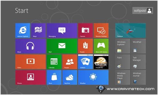
Windows 8 Release Preview – Microsoft is not interested in surprising us with Windows 8. From the developer’s preview to the Consumer Preview to the newest Release Candidate (officially called the “Release Preview”), we’ve been with Redmond every step of the way on the biggest overhaul in decades of the world’s most popular operating system. With a “near-final” and “feature-complete” version in front of us, we can make a confident appraisal of this fall’s official retail version.
Whether you were excited or critical about the Consumer Preview, there’s simply a little more to love about the Release Preview. A few new features and several apps have been added, some frustrations have been smoothed out, and performance has notably increased. On the other hand, those who were severely critical of Windows 8 will not be won over; the core functionality is the same, and the focus on Metro is even more pronounced than ever.
We’ll start on a positive note. Design aficionados and casual users will have good reason to celebrate, and tablet users — even iPad users — have new reasons to look forward to getting their fingers on the finished product.
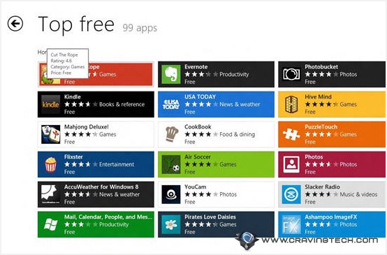
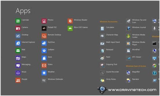
- Apps aplenty. New additions include Microsoft’s Travel, Sports, Maps, and News, all blending seamlessly into the Metro aesthetic. And each of the apps that we saw in the Consumer Preview have notable improvements in the look and feature set, even Finance, which was the best of the bunch to start with. There are far more Live Tiles to spice up the appearance and info quotient. Given Microsoft’s app previews and open arms to developers, there’s every reason to expect Metro to offer an even more robust app selection at launch.
- News is impressively comprehensive, with well over one hundred feeds broken down into various categories. You can displayed each feed in the (rather attractive) Sources list, and add any individual Source to your Home screen. Sports has a similar layout, except grouped into type of sport, leagues, and individual teams, which also can be pinned to the Home screen.
- Travel provides a beautiful photo-rich layout, breaking down into destinations and from there to Bing-powered booking of flight, hotel, and car reservations. And once you’re on the ground, you can even get up-to-the-minute traffic info on Maps.
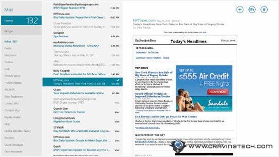
- Mail has especially improved since the Consumer Preview, and now sports a fully-configurable three-pane view. Along with full Calendar and People integration, what was once barely an improvement over a default smartphone mail app is now good enough to use daily for everything except the most advanced Outlook/Thunderbird options.
- The People app has more options for more social media accounts, and the Share button on the Charms menu now connects seamlessly to your social networks across all relevant apps, including files from your integrated SkyDrive account, which are just as easily accessible as local files and folders.
- Multitasking Metro. Speaking of apps, I had a baffling experience trying to get Metro to multitask on the Consumer Preview. The Release Preview seems to have nailed down the snapping of apps to make it more intuitive and more inclusive of the available apps. This alone puts Windows 8 in a good position to compete with the single-minded iPad.
- Flash Forward. Yes, we see the triumphant return of the missing Adobe integration in both the desktop and Metro versions of Internet Explorer 10. Unlike the “full” desktop version, Metro’s IE 10 doesn’t provide complete plug-in functionality, but instead integrates Flash directly into the source code for whitelisted sites. This means that not all Flash-powered sites will be supported on your Metro tablet, but it’s better than none (right, Apple fans?).
- Navigation via hot corners and the “Charms” menu has been refined to allow for more efficient and intuitive usability, even with a mouse and keyboard control scheme. Tablet users will notice less of an improvement, although several commands that used to take three gestures can now be accomplished in two.
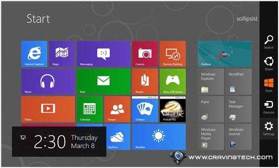
- Performance has been boosted across the board and the updated requirements allow a wide variety of less-powerful machines.
- The Spice of Life. Not a huge deal, but the Start Screen now offers more choices for color schemes and the Lock screen background pic.
Windows 8 Release Preview definitely shows improvements, but there are some new areas that could, nay, should have been given more attention. Plus, there are odd changes that are actually a step backward from the Consumer Preview.
- Out of Aero. Depending on how you feel about Aero, its loss may come as no real drawback. However, the glassy borders and translucent effect that have characterized Windows since about 2003 or so have become a little too distracting (or possibly too graphics-intensive) for Microsoft’s new Metro design aesthetic. Ironically, Aero still appeared in the Release Preview, making the definition of “feature-complete” a little more blurred.
- Vision Problems. Multimonitor control has been improved, but Windows 8 is still too likely to get confused by shared edges. And the devs seem utterly incapable of successfully implementing the seemingly obvious solution of putting Metro on one screen and desktop Windows 8 on another screen.
- Start Again. Not only is there still no Start button (the single most common complaint among critics), but there are rumors that Microsoft is furiously stripping any legacy code that could allow third-party manufacturers to give it back.
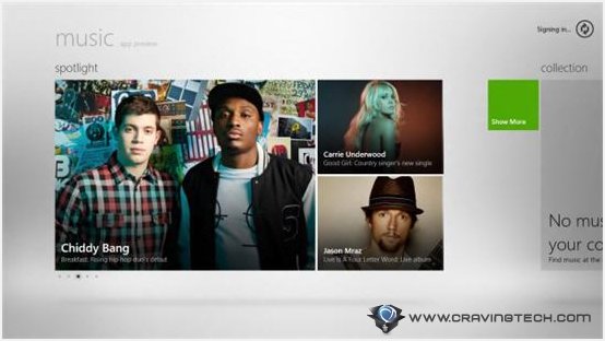
- The utterly baffling organization of the Music app has not been improved, and you can’t even directly access the volume controls: Boo. When you find yourself wishing for even the functionality of Windows Media Player (absent from Windows 8 without a counter-intuitive manual download and installation), you know you’re in trouble.
- Performance improvements aren’t enough to justify an OS upgrade. If your hardware struggles with Windows 7, it will struggle even more with Windows 8. Plus, the official requirements are a bit deceptive; if your machine just makes it, or even seems to exceed them with older hardware, your experience will be disappointingly sluggish.
- Despite calling it “feature-complete,” this is obviously just a Preview. Along with the soon-to-be-axed Aero and the ability to boot to the desktop (an important consideration for business/IT users who could care less about Metro), we can expect a number of crucial changes before Windows 8 is Released to Manufacturing.
- Microsoft is stubbornly refusing to rename the “Charms” menu. It’s magically ridiculous.
As we’ve said, nobody who hated Metro is going to be won over. For hardcore desktop users, sticking with Windows 7 may still be the best option. For tablet or touchscreen monitor users, Windows 8 is a slam dunk that could steal plenty of Android and iPad users back into the Microsoft fold. For those of us in the middle, a “try before you buy” download of the Consumer Preview will give you the best idea so far about whether the 8th time is truly the Charm.
Note: This guest post was written by Greg Buckskin at CableTV.com where he is a writer and internet marketer.

Comments are closed.